Fun & Clever Branding Examples
It’s another Expert Briefs, where I ask really smart business owners to answer your burning questions.
This week I asked our panel of experts…
“Last week, we talked about branding. Do you have any
examples of interesting, fun, or even odd brands that
stand out to you and that you love?”
I think you'll enjoy the responses.
 Kevin Riley of Maximize Your E-Mail Marketing Profits In 2013 says:
For many years, I've been in awe of the branding of Amazon. The whole A to Z promise in their name. The implication that it is huge (Amazon River). The fact that everyone (even those who rarely shop online) know Amazon, and most have shopped there at least once. The fact that they snagged a memorable name that starts with A – and it's not Acme or Ajax.
![]()
You can learn about email marketing from
Kevin here -> Maximum E-Mail Marketing Profits In 2013
 Lou Bortone of Video in a Day says:
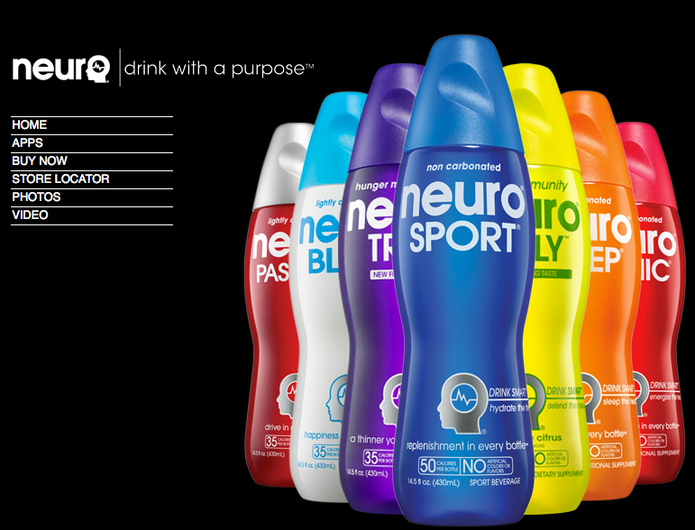
One of the “new” brands that I'm enamored with at the moment is “Neuro” beverages. (http://drinkneuro.com/)
In the hyper-competitive world of sport and vitamin beverages, Neuro stands out with it's cool packaging, flavors and marketing. Check out their website and take note of the style, colors and “attitude” of the brand. And with flavor choices like “bliss,” “passion,” and “sonic,” the drink is almost irresistible. Neuro has all the makings of a brand on the move.
![]()
Want to learn about adding video in your business?
Lou's your man. -> Video in a Day
 Karon Thackston of Step-by-Step Copywriting Course says:
Check out Sally Hogshead's book “Fascinate: Your 7 Triggers to Persuasion and Captivation” which has awesome stories about branding. One that stands out is how the liquor company Jagermeister built a very successful brand based on just how disgusting their product tastes.
Now THAT'S odd and creative!
![]()
When you think Copywriting, you think of Karon.
Check out her Step-by-Step Copywriting Course if you want to ramp up your skills.
 Tiffany Dow of Ghostwriting Cash says:
Have you ever seen the movie Crazy People with Daryl Hannah and Dudley Moore? If not, as a marketer, I highly suggest you go find it and watch it. It will leave you wishing that everyone in the world marketed that way.
It’s about a group of patients at a mental facility who start marketing for a major company. They’re so blunt and refreshingly honest that the public goes crazy for them. That’s the kind of marketing I like to see.
I love humor.
I love brands that take a stand on something.
I love brands that are honest about their products.
Old Spice is one of my favorites. The commercial with the guy who changes scenes and says, “Look at your man, now back at me…” – the company is obviously going way over the top about how a simple scent can transform your life but they do it in a hilarious way – almost making fun of their entire industry for making such claims.
When a company takes a stand on an issue, I appreciate that. I know that my dollars can go toward funding certain things that I may or may not agree with, so when they’re transparent about that – I appreciate the heads up.
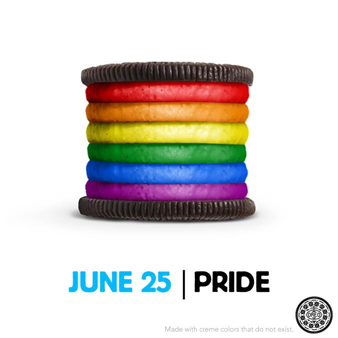
Take Oreo and their rainbow cookie for example. Ask anyone, and they’ll tell you that I’m a hardcore conservative, but that’s the one (and probably only lol) issue where I stand on the liberal side. So I loved that Oreo used their brand power for that.
Will there be companies who take a stand where I disagree with them? Yes. And I may quit spending money with them – but as a consumer, I still appreciate that they’re honest with me about it.
I have many of my own readers who say, “Tiffany – I love most of what you do, but sometimes you rub me the wrong way. However, I always know I’m getting the truth about what you believe, so I respect that and I stick around.”
That’s powerful.
Be honest and it will serve you well.
![]()
Tiffany has been a ghostwriter for years, writing for the Who's Who of Internet Marketing.
Learn her mad skills here -> Ghostwriting Cash
 Lain Ehmann of Crafting Your Business, Step-by-Step says:
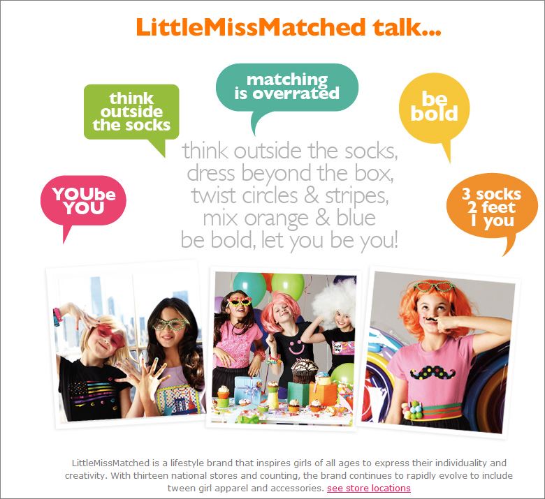
I love Little Miss Matched, at littlemissmatched.com. They started the trend of wearing two non-matching socks, and their website is exciting, fun, and colorful – just like the brand! But at the same time they're iconoclasts, they also make it easy for people to buy.
The areas in which they've chosen to be different don't interfere with letting people find what they want and actually purchase from them.
![]()
Lain Can Show you How to Craft Your Business.
Learn more here -> Crafting Your Business, Step-by-Step
 Nicole Dean of .. here! .. says:
I've got company over so I'll answer short and sweet. Here are a few brands that make me happy.
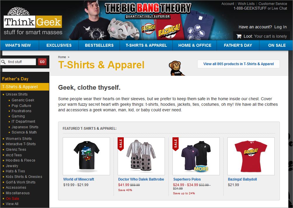
One of my favorite brands is ThinkGeek.com. Clever and Fun. ‘Nuff said.
Another brand that I've been watching has been Charmin. Here's their latest post. (#tweetfromtheseat)
I also find a lot of liquor brands to be quite creative.
Lessons Learned from the Liquor Store.
My favorite place to go for marketing inspiration, especially when it comes to creative branding, is the liquor store.
Well, for that reason and so I can grab some wine, of course. 🙂
On my mastermind weekend with Connie Green, we stopped at a liquor store so that I could grab some wine. I mentioned to Connie my fascination with the branding on the bottles and she, so graciously asked the gentleman running the store if I could take a few pictures. He agreed. I was so excited!
Here are a couple of the pictures that I took in those few minutes….
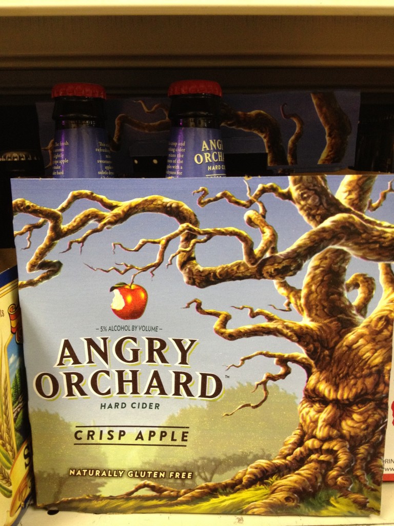
Angry Orchard.
I love how the creators of this brand took the Wizard of Oz reference and ran with it.
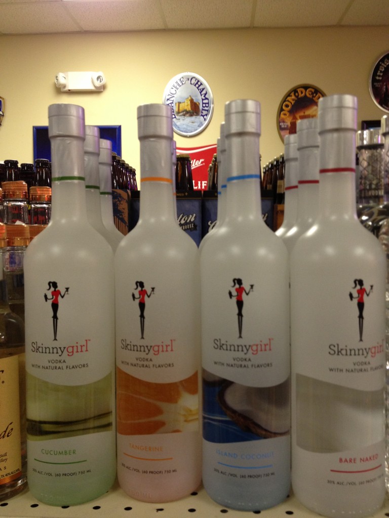
Skinny Girl Cocktails.
I could write for days about Skinny Girl and their brand. But, basically, who wants a beer gut? Skinny girl to the rescue.
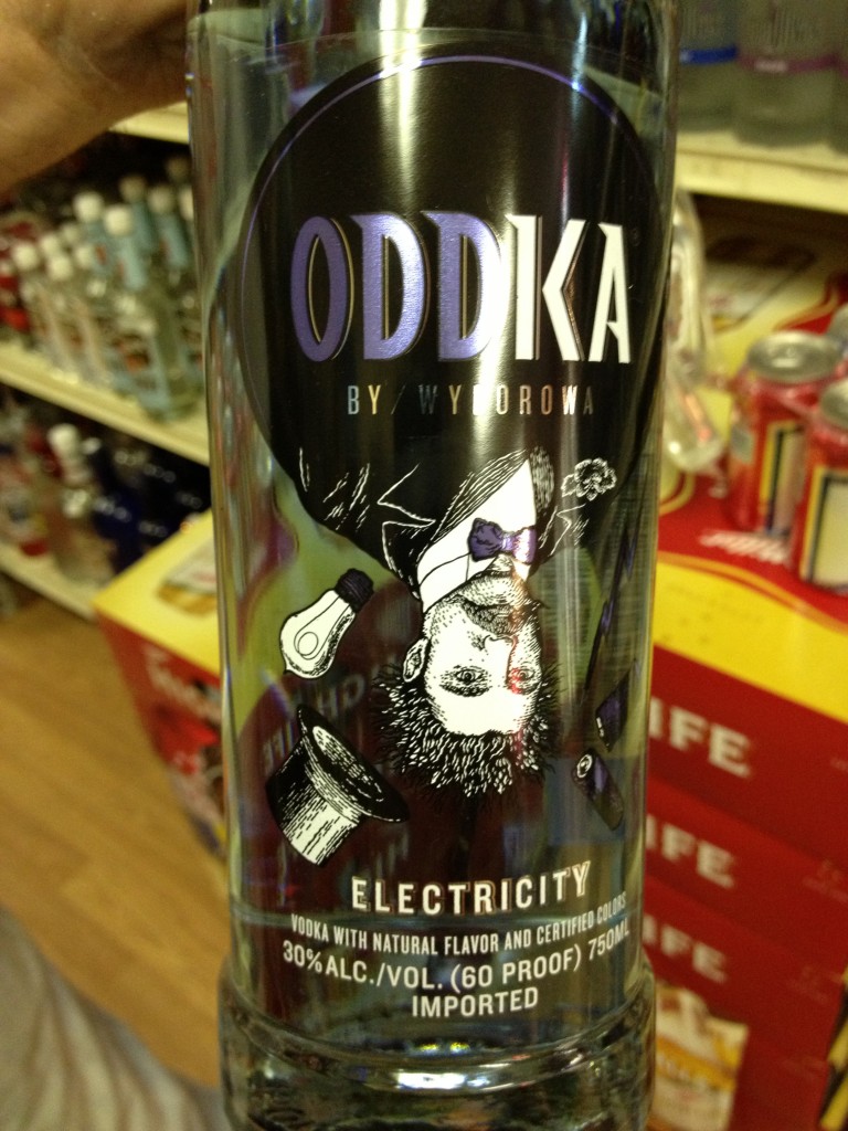
Oddka Vodka.
Last but certainly not least is Oddka Vodka.
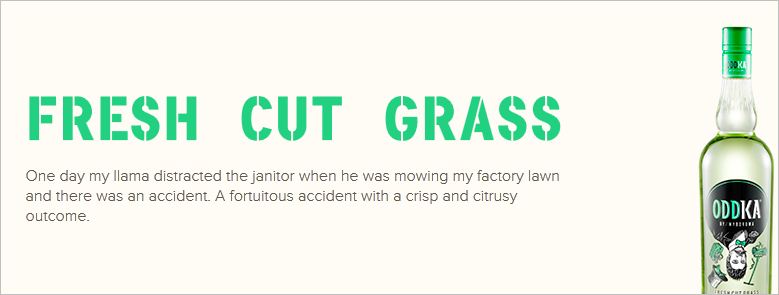
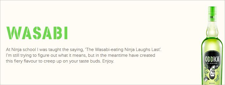
What makes Oddka unique? Well, they have oddly flavored Vodka. Nothing as cool as Bacon Vodka, but still pretty awesome as you are about to see.
Their two oddest flavors are Fresh Cut Grass and Wasabi.
See?
and
Oddka reminds me of Harry Potter's Bertie Bott's Every Flavour Beans ? 1.2 oz Box – the jelly beans that come in earthworm, fresh cut grass, and booger flavor. Why not attract that market for vodka? (Not that I want to drink Booger Vodka, but you get what I mean.)
So talk to me.
Where do you find odd inspiration for your marketing?
Warmly,
Nicole Dean
PS. Yes, if you are over the age of 21, feel free to click on any of the images above and check them out. It's a pretty interesting study in branding if you ask me.
Big Favor – If you love Expert Briefs, be sure to check out my smart friends.
The more peeps I send their way, the more I can get them to contribute. Here are the links again in the order that I received their responses.




Tiffany Dow
June 6, 2013 at 4:53 pmHOW funny Nicole! I was JUST at the store yesterday and I saw Angry Orchard and I immediately thought, “I wouldn’t drink it, but I’d love to own that box.” It was like a piece of artwork. I loved it. Love the Charmin, too.
Nicole
June 7, 2013 at 11:27 amIt is definitely beautiful artwork. I agree. Cool brand, well presented. I don’t know how the product tastes yet, but it sure is appealing to me.
Amanda Thomas
June 6, 2013 at 6:40 pmI love when companies aren’t afraid to have a bit of fun with their branding and marketing. It helps you make that connection with the company as you would a person. Any company that takes time to tweet back and forth is always great too. I’ve seen some hilarious stuff from Taco Bell including tweeting back and forth with other companies.
Loralee Hutton
June 6, 2013 at 6:11 pmI walked into a little local liquor store to buy ice on the way to a BBQ while wearing pink strappy sandals & one of my favorite pink skirts. The store owner saw me walk straight to the ice cooler and then I heard him say, “Oh, I have the perfect wine for you! You must try it!” And promptly handed over a tall, gorgeous bottle with a pink label & top, aptly named the B word that I won’t type on your comments page.
I never went back to that local liquor store. And I’ll never really know if he was complimenting me on my adorable shoes, or calling me names.
And yes, I’m completely fascinated by unique branding & should spend a tiny bit more time working on my own, I’m guessing.
Nicole
June 7, 2013 at 11:26 ameek. It sounds to me like that liquor store owner was looking to get his over the head with that bottle of wine. Yowza!
Debi J
June 7, 2013 at 12:53 amI’ve noticed that it’s the “ongoing” ads that catch my attention and get me (along with everyone around me) talking, asking “hey have you seen the one….”, etc.
It started years ago with the Tasters Choice commercials where the lady borrows coffee from her upstairs neighbor…. and then there’s a story that unfolds in the future commercials… he comes to borrow something from her… her ex shows up in one… and so on.
Nowadays, it’s the AT&T commercials with the kids (you don’t hear all my friends talking about Sprint or Verizon that way and none of us use AT&T. But they’re hilarious and involve KIDS.
Then there’s the State Farm guy who’s talking to Jake at 3am and gets busted by a wife who doesn’t believe him (and he’s the same guy on the McDonald’s egg white mcmuffin ad).
Allstate has normal people (kids included) who suddenly start talking like the really deep-voice Allstate guy.
And I could talk forever about Flo. I haven’t seen someone find a following so fast since the “Where’s the beef” lady for Wendy’s!
So for me… stories, kids, real people, and humor…. hmmmmm… just figured out my path for marketing! 😀
Scott Worthington
June 7, 2013 at 3:12 amOkay, I’m an idiot. I have shopped with Amazon for over 10 years and NEVER caught the A to Z symbolism in their logo. Thanks, Kevin for revealing that big secret (the one that everyone but me knows).
I wouldn’t buy liquor based on the branding that you shared. I’m pretty conservative, and look for more traditional branding. Oh, and I’m a Bourbon man.
Nicole, I think I may be the only one on the planet that is turned off by your underwear on the line. Sorry. I did buy your blogging book even though you upped the ante to two pairs of undies on the cover. I don’t really get it myself, but I think it’s not near as cute to a man as it is to a Mom, used to doing laundry for her kids. (That’s not a shot about “women’s work”. I’m single, I do my own laundry, cooking, etc.)
Regardless the quality of your content, that image makes it difficult for me to take you seriously. Thing is, I know that you are serious and well respected.
Pam
June 7, 2013 at 1:42 pmYou’re not the only one who didn’t the the A to Z symbolism. I thought it was a lopsided smile all this time…….
Joyce Reid
June 7, 2013 at 9:16 amScott, your statement abut the underwear on the line is an excellent example of how careful you have to be about humor. Humor is in the eye of the person seeing/hearing it. What one person may think is funny turns another one off.
II understand the take on the briefs. But ‘m a mom and a grandmom and I, too, agree with you that it’s too cutesy and doesn’t appeal to me. But that’s me. I’m sure that there are many others who think it is a great branding trick.
Tracy Roberts
June 7, 2013 at 10:49 amThe image on Expert Briefs is a perfect example of how branding helps to attract your target market.
Although the image isn’t my favorite, after taking a look at the TOC and knowing that Nicole is not only smart herself but that she surrounds herself with smart people it would be stupid of me to not read something she wrote based on the cover alone.
The image is a fun representation of expert tid-bits in a business that can, at times, take itself too seriously. Embrace the fun, learn from the info, put it into action and prosper!
Kenneth Glick
June 13, 2013 at 12:42 pmThe problem with “clever” branding ideas is that one can be too clever for their own good as sometimes the ad firm that creates the image could be a little too esoteric in their design. A good example of this are TV commercials where you watch the ad and possibly even enjoy it and then come away not knowing what the commercial was selling.
To me, the most dramatic example was perhaps 15 to 20 years ago when Heineken beer try to promote its product by promoting the red star on its label. Now, I’ve had my share of Heineken beers but I had never noticed the star on the label so when I saw the commercial for the first few times, I had no idea what the name of the company selling the beer.
Well, anyway. That’s my two cents.
Mandy
July 6, 2013 at 7:54 amA bad commercial or brand style can turn someone off quicker than a customer
Mandy
July 6, 2013 at 7:56 amLet me fix my previous statement: A bad commercial or brand style can be a turnoff to customers quicker than a good, quirky brand name.
be careful.