Your #1 Tip for a Great “About” Page
It’s another Expert Briefs, where I ask really smart business owners to answer your burning questions.
This week I asked our panel of experts…
“About” pages. What is your #1 tip for a great ‘About' page on your websites?”
I think you'll find the responses interesting.
Kristen Eckstein of Get Published on Kindle in 30 Days says:
A PR expert once told me to sprinkle testimonials throughout my lengthy bio on my About Page. I did that by taking screen shots of social proof and inserting those throughout. I've gotten many compliments from people who decided to hire my team because I was gently guiding them through why they should hire me.
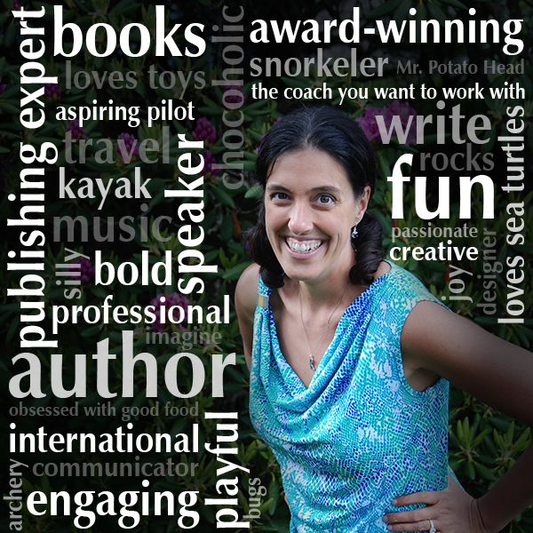
In addition, I recently added a super fun graphic as my headshot on the page.
I got the idea partially from the word clouds that used to be so popular on websites and my VA, Natalie Collins, who was playing around with adding words to her photos. I created a really fun graphic that captures exactly what I'm all about in a way that draws visitors in and makes them stay longer, then of course, want to get to know me better.
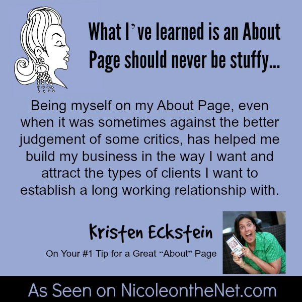
What I've learned is an About Page should never be stuffy, unless that's the market you're trying to reach. Being myself on my About Page, even when it was sometimes against the better judgement of some critics, has helped me build my business in the way I want and attract the types of clients I want to establish a long working relationship with.
Lynn Terry of How to Get Social Marketing Results in Just Minutes a Day says:
I'll make this short & sweet. My top tip for your About page is to make sure you include a call-to-action on that page! 😉 Put yourself in the shoes of your visitor. Click on your own About page and read it. Now – what should you do next? What do you _want_ your visitor to do next, after reading this page?
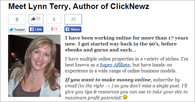 Make sure that “next best click” is very clear and super obvious!
Tiffany Dow of Work Life Balance says:
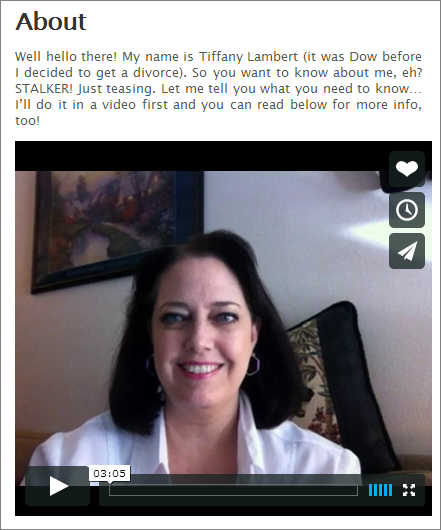
My #1 tip for an About page is to weed out your non-audience by being highly transparent. I like an About page that uses first person, not something that reads like a sterile biography someone else created, such as, “Tiffany graduated from…” Boring!
I love to use a combination of video and text. Video is GREAT for an About page because it helps people get a feel for your personality better than plain words on a screen.
When I create my About pages, I don’t just talk about what I offer – I talk about what I don’t, or why the visitor may NOT like me. Why do I do that? Two reasons.
First, it helps those who will get offended by me leave early so we don’t have to end up arguing about anything. Second, it helps those who like my style instantly appreciate that I’m going to be myself – and not phony.
On one of my About pages, I specifically tell them upfront “I’m motivating for many people and offensive to a handful.” I tell them I’m blunt.
Tell people what you’re like in terms of teaching – what do you share, why do you do it, and how? Give them a reason to love or hate you – but most of all, avoid being boring and middle of the road. Nobody is attracted to that.
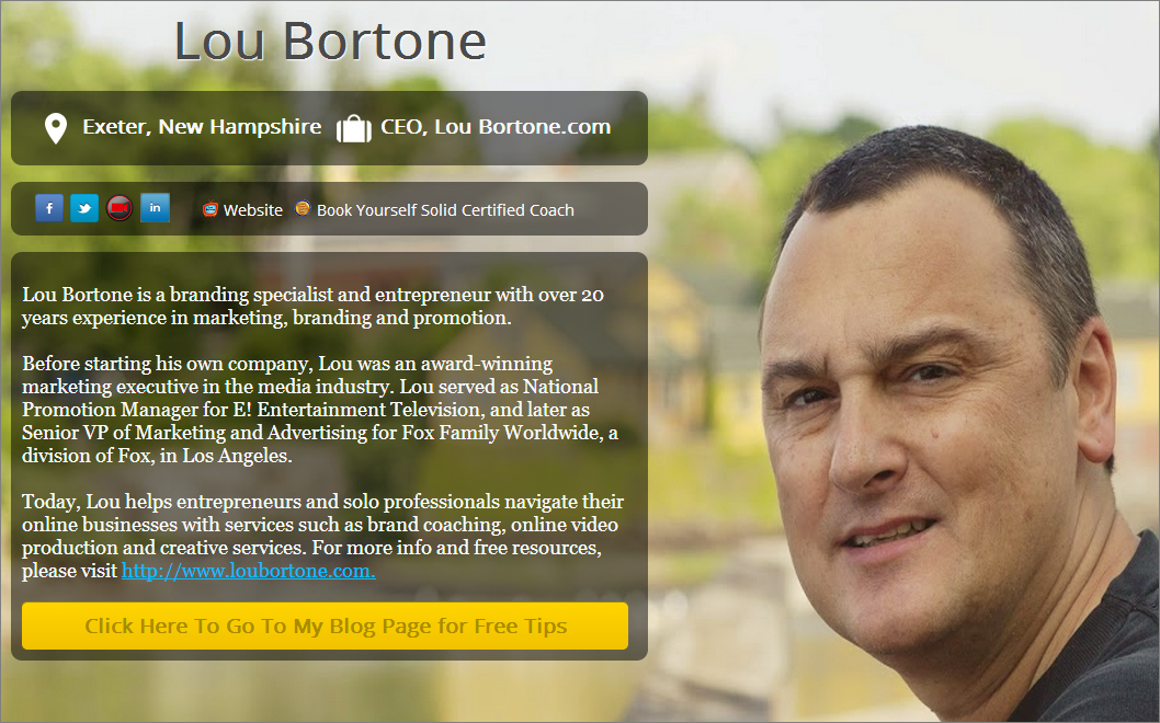
Lou Bortone of Video in a Day says:
I think “about” pages represent a huge opportunity for business owners, but I also think many people miss the boat on this opportunity. An about page is a chance to show off your personality, and give prospects and partners a better sense of what you're all about. An about page is also the perfect place for an “about me” video to show off your skills and connect with your web visitors. My tip for entrepreneurs is to make the most of your about page, and don't settle for the typical (boring) bio and head shot.
I have a ‘one page' website, so my opt-in video doubles as my about video, but I also use a pretty cool LeadPage template that serves as a “bio” page.
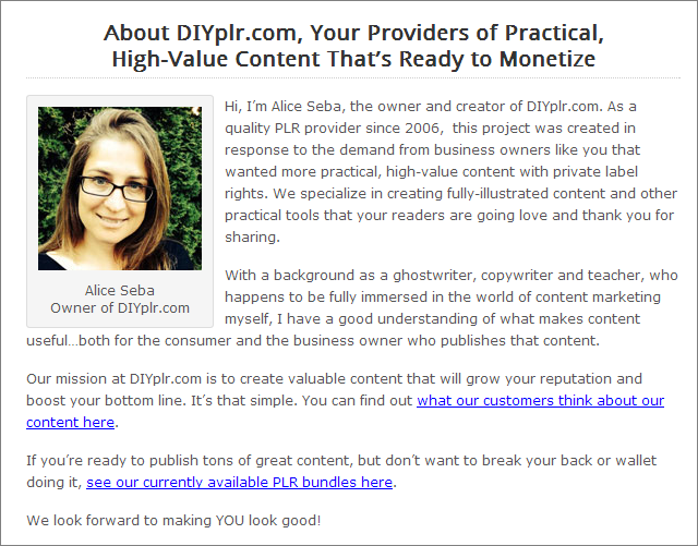
Alice Seba of The 30 Day List Challenge says:
Even though an about page is about “Me” or “Us”, it's like any other marketing piece you put together. It has to be about the reader. So while you may be singing your praises and giving some more insight into who you are, you have to show how this benefits your audience. The goal of your about page should be to show your visitor why they should pay attention to you and stick around to learn more.
I cover this in our Persuasive Writing Course and here is an excerpt from that course:
—- START EXCERPT —-
If people are thinking about doing business with you, they’ll often look at your About Me page. They want to know who they’re dealing with and if you’re qualified to help them with what they need. If you don’t have an about me page…make one. If you do have one…let’s see if we can make it better.
Start with a headline other than “About Me” – what can you do for your visitor? What’s in it for them?
Focus on your reader and not you. Obviously, you’re still going to talk about your qualifications and experience, but you’re going to relate that to your reader. So if you have a degree or background in an area, you’re going to show why that matters to them.
For example, “With 20 years experience as a personal chef focusing on healthy foods and promoting weight loss in my clients, I’ve brought together some of my favourite recipes and approaches to meal planning, so you can follow your own path to nutrition and optimal health.”
Include a call-to-action. Where should they go next? I’d recommend sending them to an opt-in offer. Something they can get for free to get to know you better before they buy anything…but they also get on your list, so you can email them some more.
A lot of About Me pages are in the third person and I think that can work, but personally, I think it’s a bit dull and puts a space between you and your visitor. Speak in the first person and use words like “we” and “I” and more importantly, use the word “you.”
In most cases, you can have fun with it…share your own opinions and personal philosophies. Show your personality and let them get a great sense of what you’re all about and why they should stick around for more.
—- END EXCERPT —-
Sorry, I think that was more than one tip, but they all fall under the main idea of showing your readers what they want to know.
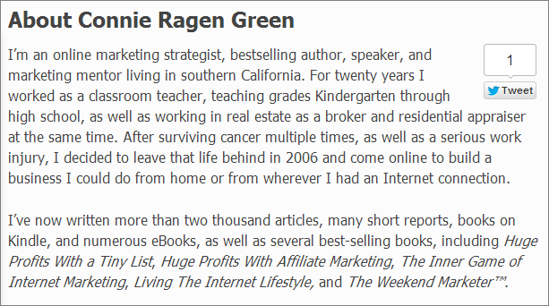
 Connie Ragen Green of Affiliate Marketing Case Studies says:
My best tip for an effective and memorable ‘About' page is to always think of it as a work in progress. I like to share a little about how I came to be an online entrepreneur, but I also include up to date information and details about where I will be speaking, my latest published book, and other activities I am involved in. We are so much more than what we do in our businesses, and readers want to know more about our activities away from the computer.
I recommend setting up your ‘About' page with a picture that really looks like you, along with a couple of paragraphs that explain something about your background. Keep it light and informative. Don't let your page get bogged down with details of a job you had during the 1980s! Use this as a starting point to share as much or as little as you are comfortable with to the people who are interested in getting to know you better. I have two main sites and strive to keep both of my ‘About' pages current and interesting.
Kelly McCausey of Solo Smarts Podcast says:
Whenever some great web content grabs my attention, I jump over to the site's About Page to learn more about the site and the author. Knowing I do that, I'm pretty sure lots of others do it too, so I've taken time to keep my own About Page updated. I want to make sure it's ready to represent me when someone comes to learn more about Solo Smarts and me.
I've decided to keep the opening focus of my About Page on how I got started in an online business. I'm trusting that many of my About Page readers are new and seeking hope and resources. By sharing how I started small and found success, I'm trying to make a connection.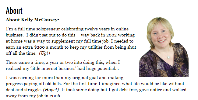
After my opening, I share a testimonial from a customer. I change this out every so often.
Then, I move into sharing links that I'm proud of under these headings:
- Kelly is Hosting Events: (Beachpreneurs, Exposure & Profit)
- Kelly is Speaking: (Live in person events)
- Kelly is Guest Blogging
- Kelly is Featured
It might seem odd to link out to other sites from my About Page, but I see it as opportunity to show social proof that other smart marketers think I'm smart.
Finally, I invite my readers to curate me. I link to articles and videos they're welcome to take and republish on their own sites and encourage them to do so with an affiliate link back to my site. I'm planning to plump up this area of the page with fresh content that promotes my new courses. Curation is a popular practice these days and I want to make sure my community realizes how easy it is to curate me for profit.
P.S. You can learn more about curation from my course, Smart Curation Skills.
Shannon Cherry of Learn How I Get *Paid* to Attend Events says:
I hate most ‘About' pages. Why?
Too many people use it to brag, when an about page is clearly a selling tool.
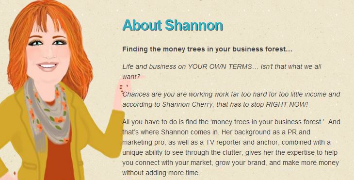
You see, you should have different about pages that target different audiences. It is impossible that one size can fit all your audiences' needs. If you are a coach, for instance, you should have an about page for your potential clients. It should tell them why they should hire you. But if you also speak, your about page should be geared to those who are looking for a speaker. And if you want media coverage? It needs to show a journalist you have got the right stuff to be interviewed.
For example, here is my about page for my blog.
And here is my info directed at event hosts and those who hire speakers.
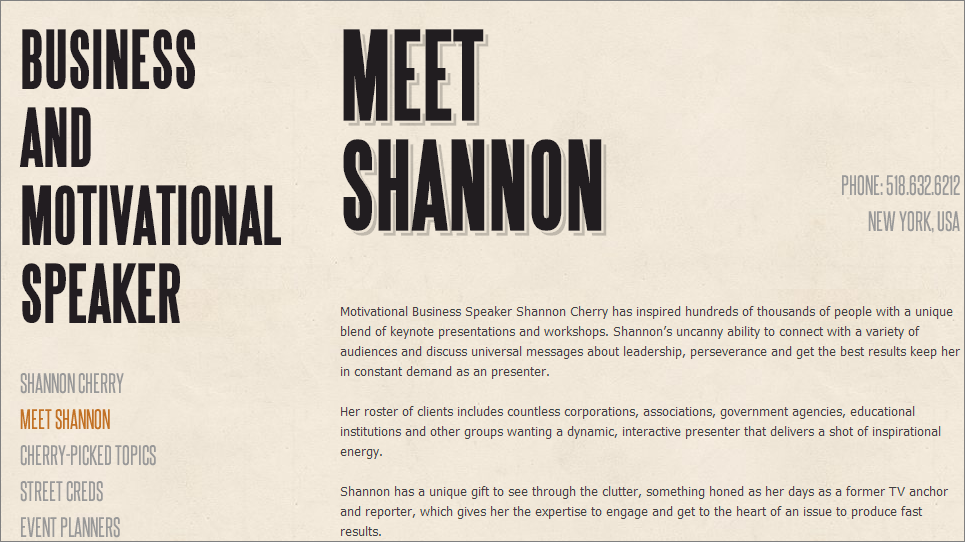
Do you see how they focus on the audience needs?
Also, did you see that the bios I shared have separate calls to action? After all, this is a selling tool, so you need to work it!
The bottom line is to remember: it's not about you, it's about the audience.
Yes, some of the information will overlap. But if you have focused on the AUDIENCE's needs, you are more likely to get the response you want.
 Nicole Dean of .. here! .. says:
One of my goals for this week was to polish up my “About page” on this site. Mission accomplished – although I know it could use another bit of elbow grease to be even better. Hence the reason for asking this week's question.
Here's what I've come up with as of today..
The intro with my main goal for anyone coming to my sites, buying my products, or hiring me as their coach.
I then lead into my Official Bio to show off my mad skillz.
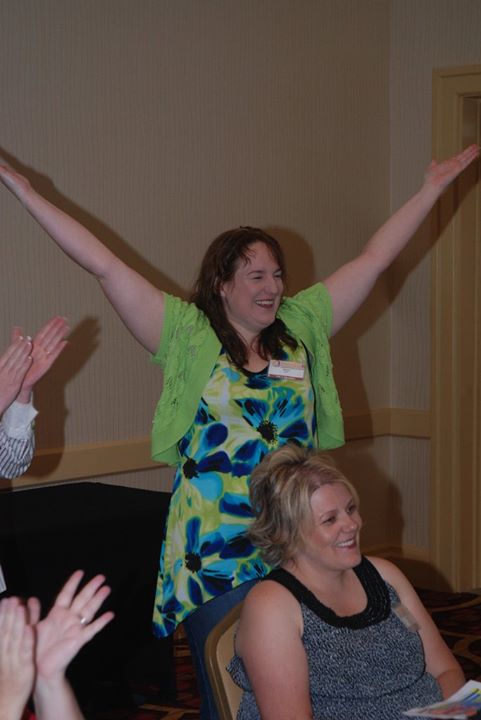
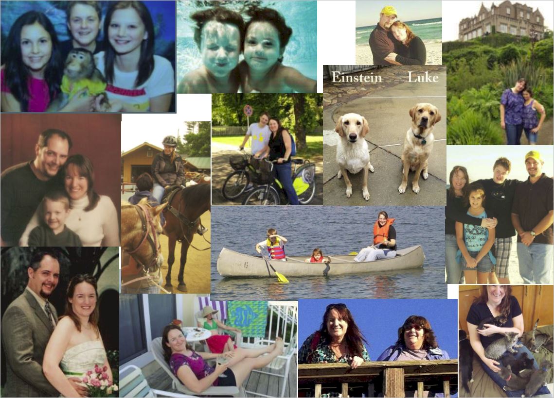
Then I go directly into the “here's me in real life” pics, like this one:
And on to…
Where I’ll Be Speaking Next:
- NAMS- Atlanta
Events I’m Hosting:
- Beachpreneurs Live – Daytona Beach
- Beachpreneurs Retreat– Pensacola Beach
Then some of my favorite testimonials that I've gathered over the years –
A way to connect with me on Social Media –
Connect with me here:
And I finished with the most important part…
All of the above is important to me, but this is my “Why”:
I'm thinking I'll switch things around a bit, but I'm already much happier with it than I was before.
What about you? Care to show off your “About” page or share someone's that you enjoyed reading? I'm all ears.
Talk soon.
Warmly,
Nicole Dean
PS. If you're interested in this topic, I wanted to tell you about a PLR package that we have at CoachGlue.com about “About Pages”.
 It's called “From Lackluster to Blockbuster: Revamp Your ‘About' Page for Increased Credibility and Promotion” and it comes with the following:
* Report: From Lackluster to Blockbuster: Revamp Your “About” Page for Increased Credibility and Promotion (15-pages, 2983 words)
* 10 Checklists to help you revamp your “About” page
Note: This IS PLR. We just call it “Done for you Content” over there.
And, the price can not be beat. Whether you plan on reading this and applying it or creating a coaching workshop around it, it's a steal.
Check it out here: http://coachglue.com/coaching-content/revamp-your-about-page/
The checklists that you'll get include:
* Your Blockbuster About Page Call to Action
* Your Blockbuster About Page Checklist
* Your Blockbuster About Page Inspiration
* Your Blockbuster About Page Killer Headline Brainstorm
* Your Blockbuster About Page Links and Resources
* Your Blockbuster About Page Opt-In Offer
* Your Blockbuster About Page Social Media List
* Anatomy of an About Page Testimonial
* About Page Video Script
* Your Blockbuster About Page Vision
Here's that link again: http://coachglue.com/coaching-content/revamp-your-about-page/



Tanya Smith
June 12, 2014 at 6:50 pmGreat post, Nicole. I love reading about pages and I realized a year ago mine was way too stuffy…all about my alphabet soup and not enough of ME in my every day, fun form. So I revamped and wrote in 1st person, added more pics and even a board from Pinterest where I show off my “style” . Totally agree it helps people see themselves working with you. Thanks for sharing these useful tips!
Tishia Lee
June 12, 2014 at 7:06 pmLoved this post – great advice from everyone. I definitely need to do some work to my boring ole about me page!
Garry Sayer
June 13, 2014 at 3:38 amPlenty of awesome tips here from many marketers whom I look up to and follow. Thanks for gathering them all together Nicole.
I especially liked Lynn’s tip on creating a call to action on your about page and Tiffany’s tip on weeding out those you don’t want on your list by telling them the sort of marketer you’re not.
My task for the weekend? Change the about page on a couple of my sites.
Karen
June 14, 2014 at 5:00 amSo much good advice here. I love Kristen’s word cloud idea. I already work with Kristen as both a student and an affiliate, but I still learned something new about her from her word cloud pic. Gives me lots to relate to, as I’m also a chocoholic snorkeler who loves sea turtles, kayaking and archery, (what are the odds?) and puts a lot of info across in an instant, visual way.
Nancy Juetten
June 15, 2014 at 12:47 amSo many bios go on and on about every hat the featured person wears and EXCLUDE the WOW and the WIN for the client. If client attraction is top priority, Know-Like-Trust counts and RESULTS matter most of all.
Tanya
June 23, 2014 at 10:25 amVery helpful! Will be going over my about page now 🙂 Thanks for all the great tips!
Arun Kallarackal
June 29, 2014 at 1:12 amNice creative tips mentioned by smart folks. When it comes to about page, transparency is something that I will give much importance from now on.
Also, giving it a touch of fun, humor is also something that I plan to do. So far, it has been all serious stuff mentioned on an About section. Will try to be more creative and funny with it from now on, being transparent at the same time. 🙂
Arun
Kaloyan Banev
July 1, 2014 at 9:17 pmGood about pages examples, without a doubt many bloggers forget about about page or team page, if any.
Rose McGrory
July 2, 2014 at 2:43 amSome great tips here. I personally dislike having to get information from a video, so if i was using video i’d include a transcript (or if not an exact transcript, most of the same info!) below it.
Personality is vital, though. There are so many corporate style, bland sites out there all trotting out the same meaningless words, that showing who you really are is a must for standing out from the crowd.
Internet Marketer Babs
July 3, 2014 at 2:54 pmYou Nicole! Are A Genius! Thanks for writing this lovely tips ma’am 🙂
Kevin Davis
August 29, 2014 at 1:08 pmGreat tips. You might also consider SEO when writing your content. What will people be searching for. Is there a specific location that you are targeting or a service you want to highlight.
jocelyn
April 12, 2015 at 9:03 pmHaving an About Page puts a real person behind every post, giving each one of them a human touch that readers can feel when they read your post.